Google finally announced the Nexus 5, Kit Kat, and all of the other goodies that came with them. One massive change they made is big improvements to the Google Experience launcher, which is just a fancy term for the stock Android launcher that comes on certain vanilla Android devices. If you have a device from Samsung or LG, then you are running a skinned version of the Android launcher, which isn’t bad, but just not exactly what Google would call their “experience.”
We want to go over all of the changes that Google made, so continue on to see what you should expect if you decided to load this onto your very own Android device.
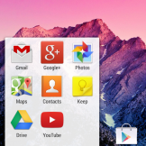
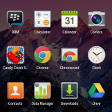
Android’s stock launcher has always been sort of simplistic, but this newest update basically redefines that meaning. Previously, when you opened the app drawer you would have two sections; your apps and your widgets. Starting with this launcher, like it was before Ice Cream Sandwich and Honeycomb, all you have is your apps in the drawer. They have created a separate section for widgets, which we are quite happy about. The icons are bright and bold, and it gives off an easy-to-see vibe that is enjoyable.
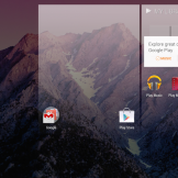
To access your widgets section, simply long press on your homescreen and you will be greeted by an entirely new interface. From here, you can choose a custom wallpaper, add widgets to your homescreen, and access the Settings menu for the launcher itself. To add a new homescreen, since you are started off with just one, you can drag one of your app icons or a new widget to the edge of your first homescreen, and you will then see a new homescreen pop up on the right side of your display. Once you see the new homescreen pop up, just drop the widget or icon where you would like it placed. You will then have multiple homescreens for adding all of your favorite widgets and folders.
Much like we saw in Jelly Bean, most widgets’ sizes can be customized and dragged to fit a certain space you are looking to fill. When moving widgets around each other, they will automatically move and get out of the way of whatever you are trying to place. And don’t forget that a simple flick of either a widget or icon can remove it from a homescreen, a feature that was also introduced in Jelly Bean.
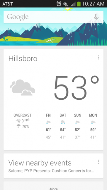
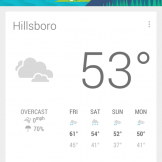
In terms of the biggest change you will see, Google decided to integrate Google Now into the launcher, which was previously accessed by opening the Google Search app or hitting on the Google search bar on your homescreen. If you owned certain devices, you could also swipe up from the bottom of your display to access it. With this launcher, simply swipe right to open up Google Now which sits on the left of your main homescreen. It’s a very cool feature, and for those that didn’t fully take advantage of Google Now, then now you don’t have an excuse not to use it.
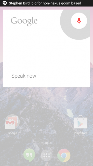
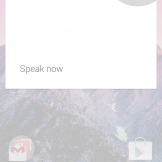
Other things you will notice are changes to the UI when switching your wallpaper (which has been simplified), a different look and animations when opening and using folders on your homescreen, plus the addition of that “always-listening” Google Search widget they have permanently placed on your main screen. All of the changes they have made make for one exciting Android experience, and as you know, that’s what we are all about.
If you want to get the latest Google Experience launcher on your device, visit this post here to find the downloads. Trust us, it’s worth your time.





0 comments:
Post a Comment